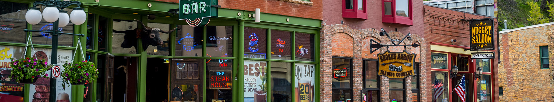
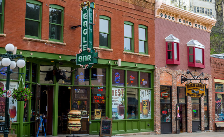
According to a report by the Signage Foundation, adding a single on-premise sign can boost sales revenue by 15% or more. If your signs aren’t performing on par, it might be time to give your graphic design some attention.
Without effective graphic design, even big-ticket, super-sized signage will fail to impress your target audience. But you don’t need a graphic design degree to stand up to the competition.
Read on to learn 3 graphic design tips that really work, or call (240)-246-7423 to speak directly with a graphic design specialist in Rockville, MD.
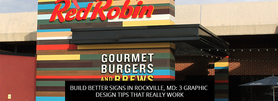
Visual hierarchy is the principle of arranging graphic design elements to show their order of importance. For example, you may want your reader to pay more attention to the details of your promotion or your call-to-action. Beyond creating a literal visual hierarchy, where the most important information is placed at the top of your graphic design, you can highlight specific elements by:
Get in touch with our graphic design team for more tips to draw the eye where you want it.
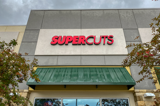
In graphic design theory, contrast is described as the visible difference in properties of the design elements in question. Creating contrast not only helps readers distinguish between different sign elements, but also increases your view count, since the human eye is drawn to contrasting shapes and colors.
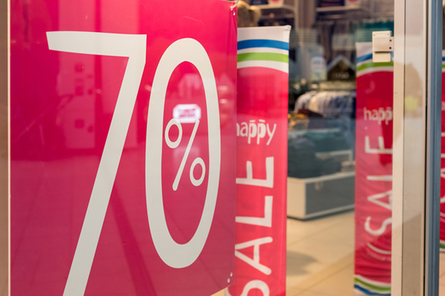
White-on-red is a classic color combo with excellent contrast, but there are many more options to choose from.
To explore all of the best high-contrast color combinations, call (240)-246-7423.
White space, sometimes called negative space, is the empty space around the content and functional elements of your sign design.
Your instinct may be to fill your sign face with as much useful content as possible in order to get your money’s worth and give your readers more bang for their buck, but this is a classic graphic design error.
A little white space goes a long way in any graphic design.
Graphic design experts understand that white space is not wasted space—on the contrary, it makes your sign content easily scannable and significantly improves legibility. In one study, researchers found that proper use of white space between lines of paragraphs and left/right margins can increase reader comprehension by up to 20%!
Whether you need help with creative ideation, design remediation, or installation, you’ll find it all at our full-service sign shop.
To start a free consultation with our graphic design team, call (240)-246-7423 or fill out our online contact form to request a callback.
Back