![]()
In a phenomenon known to researchers as “thin-slicing,” customers routinely make snap judgements about the character and quality of brands they encounter based on their logo design (Kellaris & Machleit, 2016).
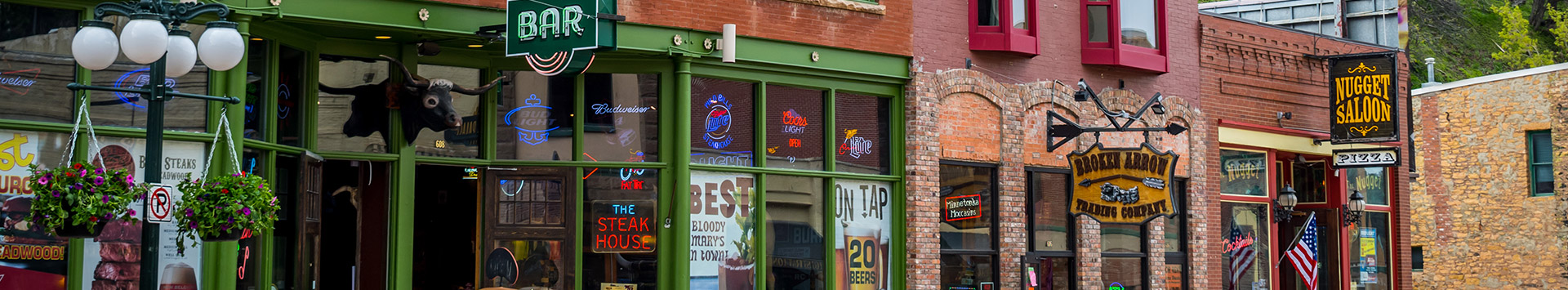
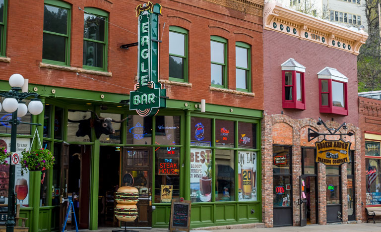
Here, we clearly see how your sign is more than a wayfinding marker; it is a window into your business, a “thin slice” of the experience they can expect once they step inside, a silent salesperson whose mute pitch can make or break your brand image.
Clearly, then, if you want to send the right message, build better impressions, and attract new audiences, proper logo design is key.
With that in mind, today’s post shares some logo design tips you can use to create better custom signs for your business in Rockville, MD, without having to add anything to your design proof—on the contrary, these tips are all about subtraction.
Read on to learn how to do less to get more out of your logo design, or call (240)-246-7423 to speak directly with our logo design department in Rockville, MD.
Don’t feel like you need to fill up the entire sign face with text or graphics. White space, also known as negative space or simply blank space, can do a lot to help you stand out and craft the right message.
For instance, according to “A Review of White Space Research,” we can use white space to:
In a study for the Interdisciplinary Journal of Signage and Wayfinding, Knuth et al. (2020) found that complex, feature-rich signs only performed well in quiet in-store settings or informational contexts (e.g. trade show booths), where readers were already browsing and seeking more information about products or promotions.
But when they tested storefront signs, billboard displays, and other outdoor branding and wayfinding signs meant for mass marketing, at-a-glance style engagement, simple designs did far better. In fact, during survey follow-ups, drivers and pedestrians both struggled to recall signs containing 4 or more visual elements, while simpler logo designs sprang to mind en masse.
Why? Because the more visual elements you add, the greater the cognitive load on the reader. And if they can’t read your message and interpret your visual elements at-a-glance, most passersby will tune it out altogether.
So what’s the bottomline? Limit yourself to 1-3 visual elements—the classic brand name and graphic combination fits the bill—so you can save time on design and enjoy better ad results.
Succinct messaging drives sales and boosts brand recall.
In one study by the University of Rhode Island, researchers found that the “remembrances of signs decrease when the number of contained words increases” (Mandel & Johnston, 2014).
Omit unnecessary characters, cramming as many value propositions into as few words as possible. Your signs will be easier to read; your core message will be clear; and you’ll have more room to upsize your letters.
If you need help trimming the fat, get in touch with our logo design team.
To book a free consultation and get a quote on logo design services, you can:
References
Hu, C., & Xu, F. (2019). A Review of White Space Research. Open Journal of Social Sciences, 7(03), 328.
Johnston, M. P., & Mandel, L. H. (2014). Are we leaving them lost in the woods with no breadcrumbs to follow? Assessing signage systems in school libraries. School Libraries Worldwide, 38-53.
Kellaris, J. J., & Machleit, K. A. (2016). Signage as marketing communication: A conceptual model and research propositions. Interdisciplinary Journal of Signage and Wayfinding, 1(1).
Knuth, M., Behe, B. K., & Huddleston, P. T. (2020). Simple or complex? Consumer response to display signs. Interdisciplinary Journal of Signage and Wayfinding, 4(2), 7-22.
Back